Saturday, 2 July 2011

Project 3 Stage 6

Stage 6 Combining textures and colour effects:

Exercise 1

I started by grading French knots, red  through to orange. In the centre I have  grouped them very closely but spaced them out as you get to the edge


Next using pastel colours I graded through the colour wheel first very densely then more spaced out.The black background seems to make the colours more intense.


Lastly just for the fun of it I stitched some knots onto a piece of Felt I had made a last May.


Exercise 2
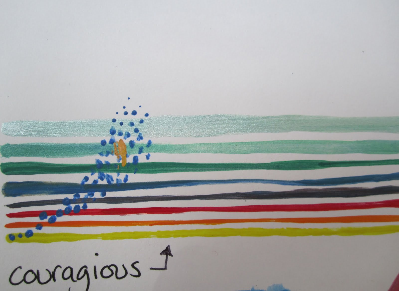
Working from a photograph of a Suffolk landscape I planned my last piece. I wanted to emphasise horizontal lines and the empty sky.


Initially I was planning to just use horizontal lines but when I started stitching the effect was not very dynamic. I then decided to stitch striped horizontal areas of colour, adding some vertical stitching to balance things out a little. The base fabric was a blue cotton with brown organza for the earth. I have added some white to the sky as it seemed a little lost when I had finished the stitching. 


I am pleased overall with the finished sample, the stitching needs to go right to the edge and I think if I were to work with this image more I would like to create a textured background first before stitching. I could also make the horizontal stripes all greens and yellows and balance the red of the buildings on the horizon with French Knot Poppies rather than the earth path and reeds. But then again the thing I love about this landscape is the blandness of it. The calm lines and the big sky. The fact you can see the town on the horizon but they are just tiny blobs. Perhaps what it needs is for the vertical reeds to be longer to give more of a sense of depth. Anyway not too bad for a first go.

Project 3 Stage 4 and 5

Stage 4 Colour Moods and themes

Exercise 1

I did this exercise with my art group. We all wrote words down on paper and then put them in a pot. We then chose words at random and tied to paint with colour and textures that represented those words. These are the words I had:


Stage 5 Coloured Stitches

I started by mixing one block of primary colour with a second. I ranged the stitching from fairly dense to fairly open. 

The yellow on Blue stands out much more than the blue on yellow

I then experimented with coloured felt in blocks of colour. The Blue here stands out well even though is it a small patch.


Lastly for this section Imade a block of red and yellow stitched in different thickness  of thread and then added blue stitching over one half.


project 3 Stage 3

Recording Colours Accurately

Exercise 2 Mixing colours to match Fabric


Exercise 3 Mixing colours to match postcards


After painting the colours to match  played about a bit with the paint left in the palette.


Exercise 4 Mixing Colours to match 3D objects


Again I played with the left over paint


Project 3 Stage 1 - 2

STAGE 1
I have looked at colour fairly recently starting to follow Betty Edwards book Color, a course in mastering the art of mixing colors. I looked back to the notes and work i did at that time and remade a colour wheel


the triangles show the Primary Colours( 4, 8 and 12) the secondary colours( 2,6 and 10) 
 the others are the tertiary colours (1,3,5,7,9,and 11) . The colours opposite each other on the circle are Complimentary Colours.

Stage 2

this stage involved looking at the effects of colour next to each other and I spent some time cutting and sticking squares of coloured paper in various combinations. It was quite an interesting process. I have no pictures of this sorry but I think the effect would not work on screen. 

Tuesday, 31 May 2011

Project 2 Stage 3 - 6

I have struggled to work out what was wanted for each Stage as they seemed to overlap in content somewhat. In the end  I have used some of my drawings and tried to represent them using the either the stitch to create texture and different yarn to create texture. This is the result:
I spent some time looking at the marks made by some of the Abstract Expressionists
and how they would translate to stitch


Then tried various experiments with Felt as the background and coloured silk thread.


Following this I looked at some drawings that I had done influenced by a painting by Farah Syed

I like this piece although the Vertical stitching gets lost
 and Perhaps would have been better in a darker thread.
 
Finally I experimented creating texture by sewing Fleece into the base fabric, also attaching rings made from cutting up a felted bracelet. The images I used for this were some I had done around Limpets.
two study pictures of limpets

Monday, 28 March 2011

Project 2 Stage 2

Stitching in straight lines.

I started with different stitches and stitched from close together to spaced. I chose to stitch on a black fabric and found it give the thread a kind of richness. Unfortunately in the photographs the black gets a little washed out.


After the straight stitching I experimented with  curved lines, overlapping lines and swirls:


following this I experimented with different sized thread


and finally different size thread together:

Sunday, 27 March 2011

Project 2 Stage 1

Now to stitching.
I have found this Stage a little confusing and not really sure what I am expected to produce.In the end I just went ahead and did what I thought was going to be useful. I looked through my collection of fabric and bits and started to sort them into colour groups as suggested. Following this, as I have not really done any embroidery, I decided to try out as many stitches as possible. Using 'The Embroidery Stitch Bible' by Betty Barnden published by search press, I made some samplers of the Stitches for fabric.(I decided to leave the canvas stitching for another occasion.) The results are below:


After this I decided to try and copy some of the marks I made in Project 1using some of the stitches from the samplers:


straight stitches

Back Stitch

Back stitch

knots